The dragon is now completed and waiting for the grout process. See previous posts for the way I do it.

The dragon is now completed and waiting for the grout process. See previous posts for the way I do it.
The dragon has been completed in gold Van Gogh glass, one of my favorites, for the 3D effect. As stated in previous posts, Van Gogh is expensive but worth it! Although I have started the background in a red stained glass, I do want to incorporate a rich blue.


The deep purple stained glass, between the pink/purple metallic vitreous and pink glitter, is a great choice. The plan is to finish the rest of the mosaic in a pink stained glass.

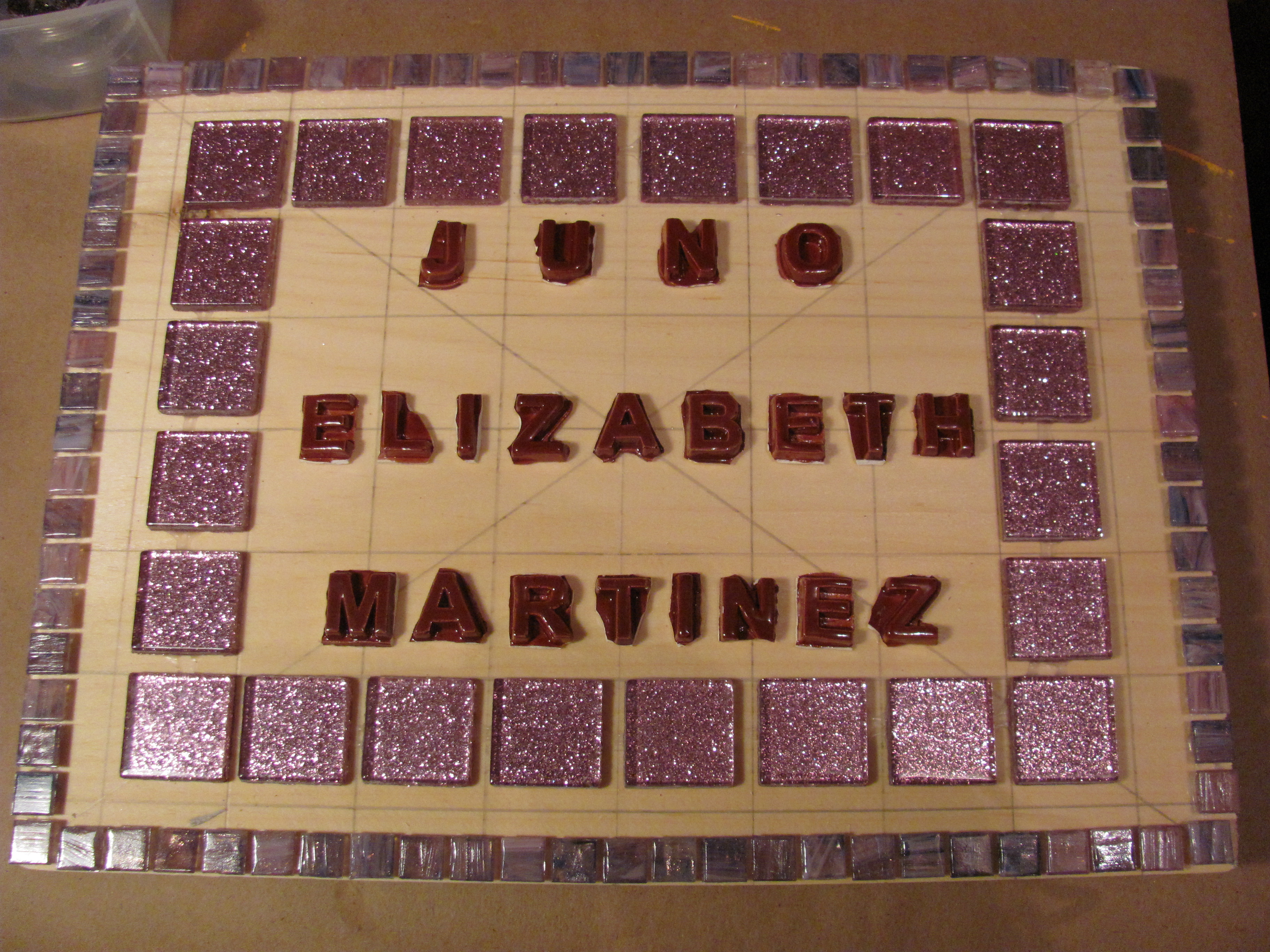
Because the client requested pink and purple tesserae in this name mosaic, I chose brown for the ceramic letters. My initial instinct was a single border, of metallic vitreous, in pink/purple hues. However, I think I will play with more border options. Absolutely, I want pink surrounding her name. Presently, I have my eye on some hues of purple stained glass and there are some lovely pink glitter glass tiles. We’ll see… Color, color, color!

The outline has been completed in black stained glass. As stated in a previous post, it’s important that you have a good amount of glue on the outline. In this case, there is excess glue after laying down the tesserae. You see gold Van Gogh for the interior of the dragon, and red for some of the background. Because red, gold and black are bold colors, I am considering a rich blue either as part of a double border, or in the background in some capacity.
Quite often, I will have an idea and then change it several times. Originally, I had planned a larger version of this dragon, using some less expensive tesserae. As stated in a previous post, making a larger more intricate design is much easier than a smaller version. Working with glass is a difficult medium in that glass is not always cooperative… I have changed the design from a large rectangle to a smaller square. That meant a few design changes for the dragon.
One of the ways I try to save money is using leftover wood in the studio. However, in this case, that would not have been the wisest decision. The rectangular pieces of wood I had left were very large, and that would mean a lot of background to mosaic. The background is not the focus, so I don’t want to use excess tesserae. In addition, I would have been “wiped out” in 2 colors. So, the design was scaled down. Because the dragon is smaller, I will be able to switch to more expensive tesserae. This dragon calls for it!